Friday, 22 June 2018

Final Model: The Bridge

EXTERIOR

The form of the architecture school responds to the geometry of its environment by following the curve of the Roundhouse and mimicking its circular shape throughout various spaces. 

The green roof allows the building to harmonise with the landscape.
The bridge is suspended over the walkway between the Squarehouse and Roundhouse. The glass walls give the building a sense of lightness and it appears to float above the passersby. 

Connection to neighbouring building. 

The spiral ramp with projecting computer labs, offices and meeting spaces and the shell shaped lecture theatre and gallery building. The spiral and shell forms are directly inspired by geometrics found in nature and formed the foundational design  concept of the school. 

View from Squarehouse. As the relationship between the building and its environment is of utmost importance, it can be seen how the design does not overpower the space but rather compliment it with its light form and use of natural materials. 
Constructing the school around the large tree was crucial in maintaining and celebrating the existing landscape. 


View from inside from which the central tree can be more greatly appreciated.


INTERIOR SPACES

Taking inspiration from the Slow House by Diller and Scofidio, various functional spaces could be created from the curved 'pop-outs'.   
The space has been divided to allow space for staff offices and computer labs for students. 
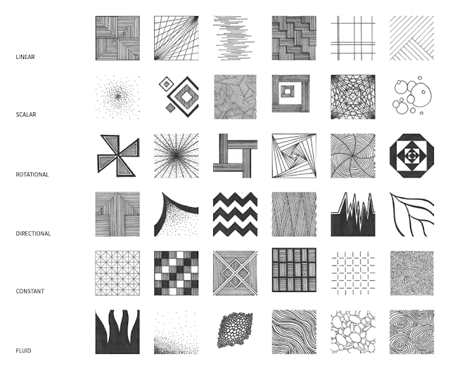
'Constant' texture on walls of computer labs.


The staff meeting room.

External view of studio spaces.

With multidirectional moving walls, the studios can transform into adaptive spaces that can reflect a required function, be it more individually focussed or collaborative. 
'Linear' texture on tabletops.

The circular shape of the library establishes it as the 'central learning hub' of the school. The skylight and glazed walls allow for plenty of natural sunlight to enter the space creating a welcoming environment. 

View out of the library at the university beyond.
'Scalar' texture on floor.
Student meeting room and general socialising area is accessed directly from the library.

The striking shell of the lecture theatre adds an interesting sculptural design element as it is an architecture school. 

The curve of the seating is reflected by the glass dome of the roof.


Below the lecture theatre is the gallery space which has been placed on ground level to allow for public access. The curvature of the gallery wall creates a logical path for people to view exhibited works. 
SketchUp Model: https://3dwarehouse.sketchup.com/model/caab64f7-f3e3-477a-9793-b27a03907a40/UNSW-The-Bridge-Model

Lumion Model: https://www.dropbox.com/h 


Peer Evaluation


Moving Elements


- Adaptability - Dynamic -

The walls of the studio spaces have been designed such that they are able to slide in multiple directions. This allows for greater flexibility in transforming each individual learning space and adapting them to respond to specific needs at any given time. 


- Geometrics - Inspired - Sustainable - 

The louvres wrapping around the exterior respond to building's need for sun shading to prevent it from overheating and enhance the comfort of occupants. Just as a mimosa fern's leaves close upon contact, each louvre acts independently upon sensing harsh direct sunlight and turn accordingly.   

Final SketchUp Model


The building's form follows the curve of the Roundhouse

Studio spaces

Office rooms and meeting spaces

Lecture theatre

Corridor of studio spaces

The Plan

"Slow House" - Diller + Scofidio, 1990


Inspired design of the Slow House implemented in my SketchUp model.

36 Movement Textures